
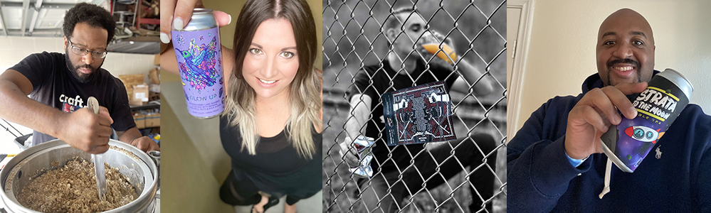
Nick @pairingwithbeer
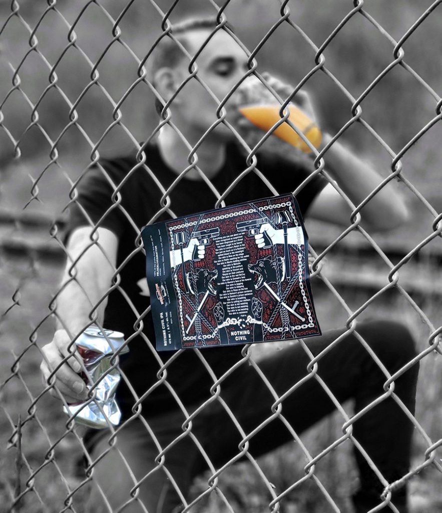
When @WellingtonBrewery released their “Nothing Civil” IPA last year, the label blew all others out of the water.
The collaboration brew, made with the help of @truthisellipsis @beer_diversity and @lexihocussmokus, is a fantastic brew, but the message on the label and the purpose behind the beer are what makes this beer so significant. Designed by @gordonsweetfruit, the label, in a very moody black-white-red colour-scheme, hosts barking dogs, pointing guns, batons, and gavels, framed by chains, which are being pulled apart by two upwards-pointing fists on the bottom of the label. The design circles a poem written by Truth Is. The words are powerful and honest; thought-provoking and real.
I strongly recommend visiting Wellington Brewery’s account, scrolling down to a post from November 6, 2020, and watching Truth Is recite her poem live, surrounded by kegs of beer in the brewery. It’s worth multiple viewings.
With 100% of the profits of the sale of this beer going to Black Lives Matter Canada, this beer was more than simply a beer.
Wellington has made 2 runs of the beer thus far – this is my plea to them for a third run.
Jamal @thehopcircles
So many breweries are out here killing it with their label art, making this really hard to just choose one over the other. How do you choose…do you go strictly off the art, does the name of the beer play a factor, what about the brewery itself, or is it all of the above? For me, Aztec Death Whistle, Wolves of Belleau, and Crayon Eater from @tacticalbrewing are by far my favorite label arts in the industry right now. If you live in Orlando or ever got a chance to get your hands on some of their releases then you know that their label art is always on point. Oddly enough, when you visit the taproom all three of these labels are drawn on each side of the soffit and it’s pretty interesting when you think about it that I picked those same three.
Lisa @hopsandflipflops
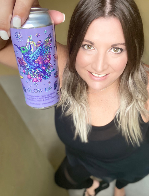
My favorite beer labels are from Florida beers, of course! And there’s a theme with the first two: I’m loving Fernandina’s Mocama brewing Aztec-esque linear graphics and gold accents. Their “Rare Cargo” can is a beautiful work of art. I’m also smitten with Tampa’s Woven Water for their clean lines, bold linear graphics and hypnotizing spirals, and I’d be remiss to say I’m more than slightly obsessed with their use of holographics in their label art. Lastly, my final Florida Favorite is Tampa’s Hidden Springs for the consistently cool and instantly recognizable colorful inked art from @akatarina – you’ll find murals of her work in the taproom and I loved her work so much that I asked her to create my Hopsandflipflops logo and it’s equally awesome and I’m so proud to support the artists who create these rad labels. I was inspired by her Blurred Limes can art but Glow Up was a recent fave that incorporated holographics along with the most gorgeous hummingbird. There’s so much rad art out there it’s us who are the lucky ones to get this much art exposure while supporting locals!
@brewbroshtx
Double IPA Collab:
You must be logged in to post a comment.